©2025
Embracing authenticity and forging a new brand identity (2024)
Personal ceramics business brand identity and visual presentation overhaul.
What is this?
Updated visual identity and brand management for my small ceramics business. In this ongoing project, I create and maintain the brand identity and art direction of my small business including digital and physical assets like logo, logotype, business cards, stickers, as well as brand identity elements like photographic approach, and brand voice.
What did I do?
- Identified brand identity and visual approach (colours, type, photography)
- Designed logo and logotype
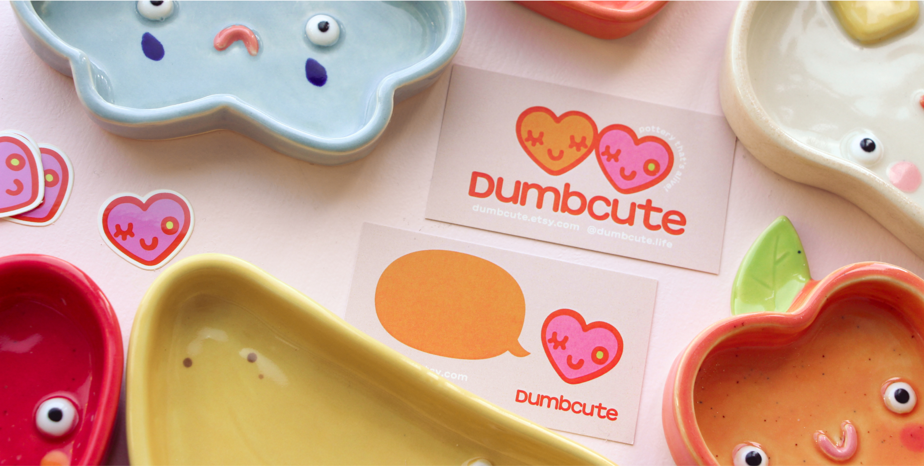
- Created digital brand assets including banners and graphics
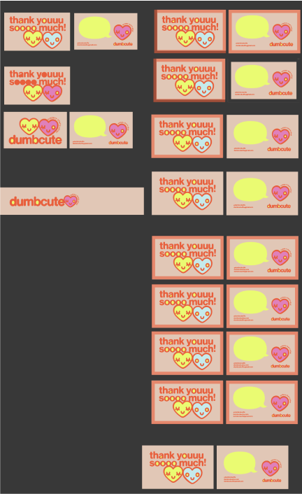
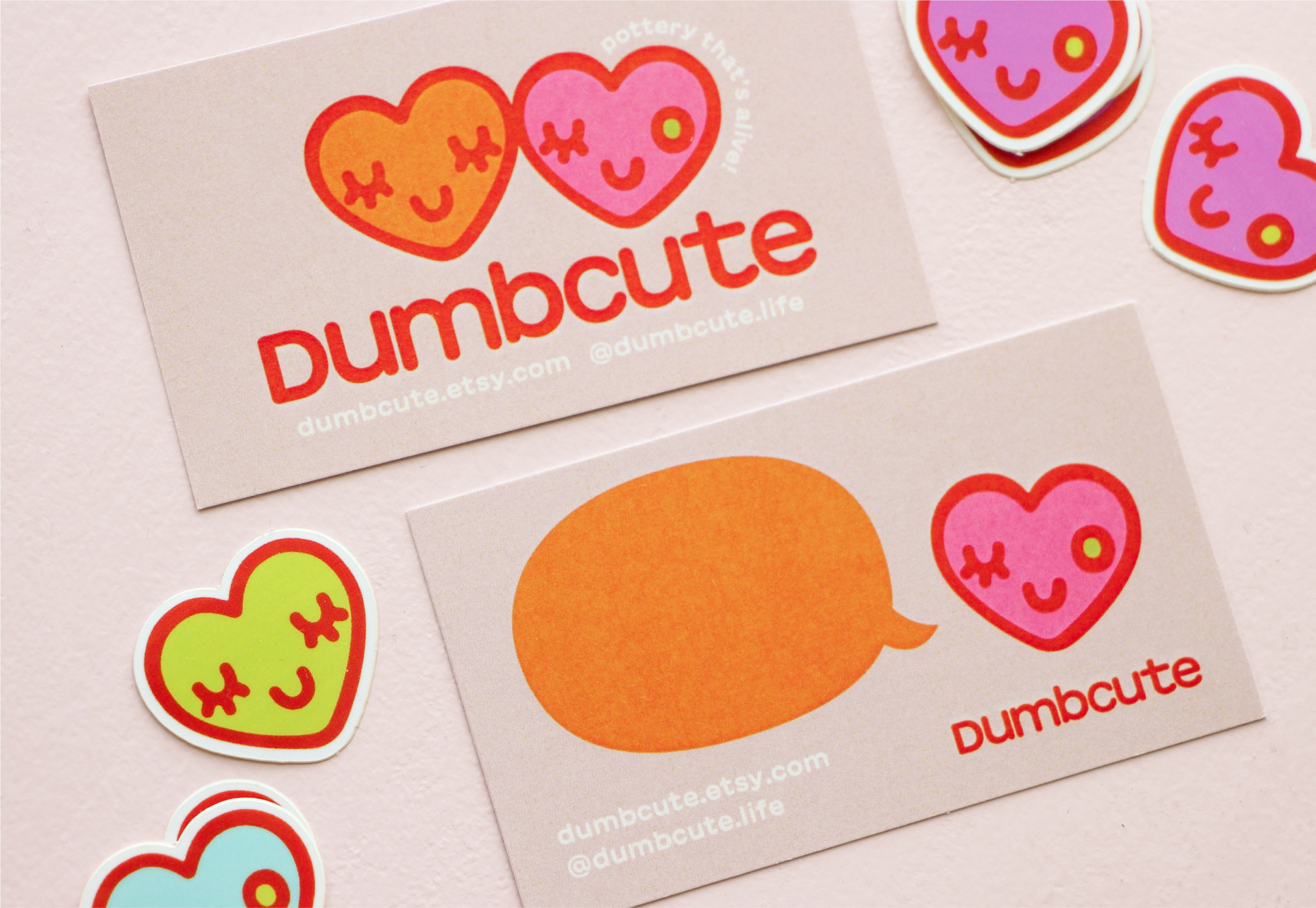
- Created physical brand assets including stickers and business cards
Why should I care?
This case is about my approach to brand identity and graphic design, and is an example of my process and decision-making when working on a visual design project. Graphic design is my bread and butter, so I thought I should include an explanation of the skillset (and passion) that lays the groundwork for most of my other design work.
The case
Time for a change
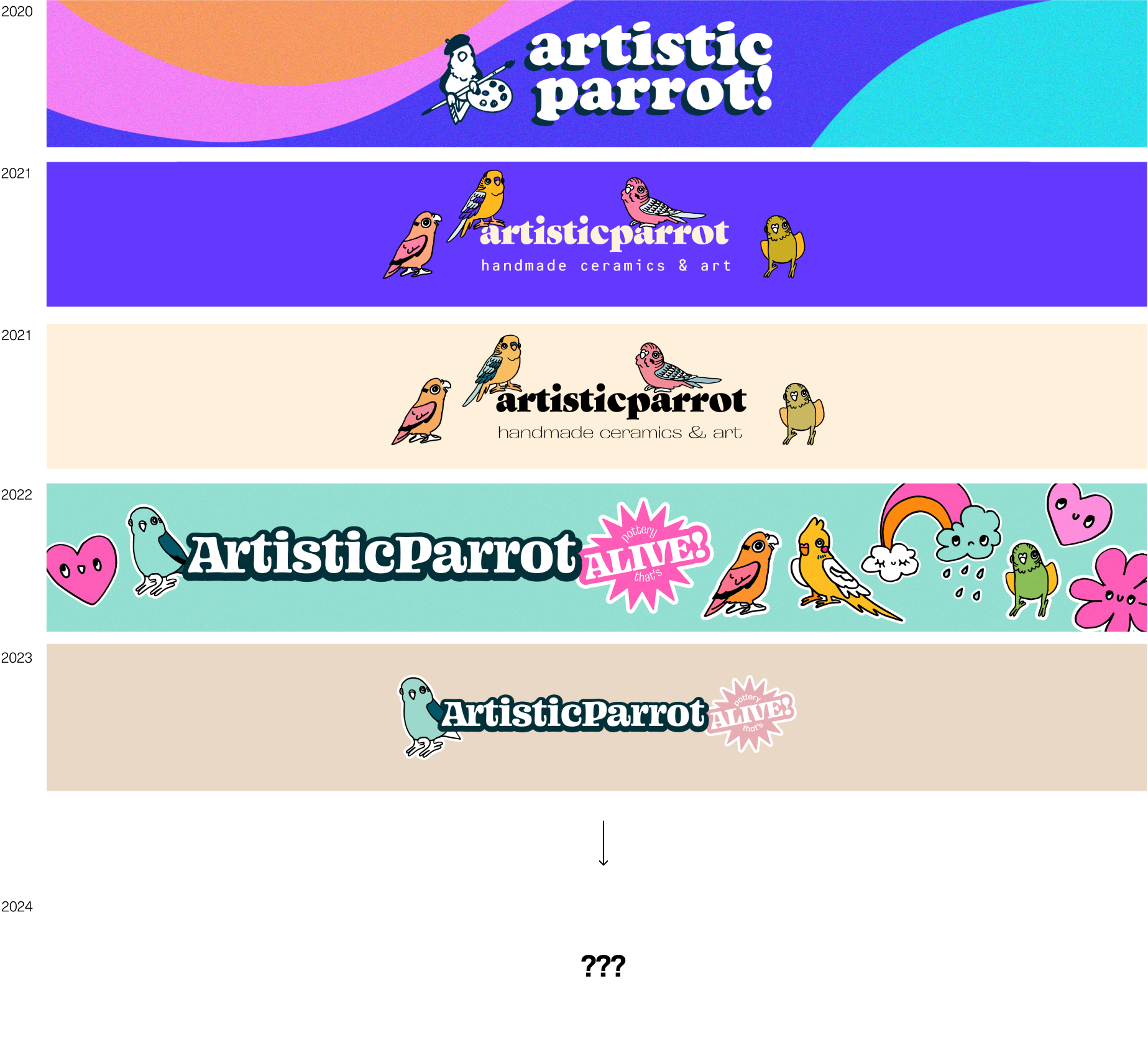
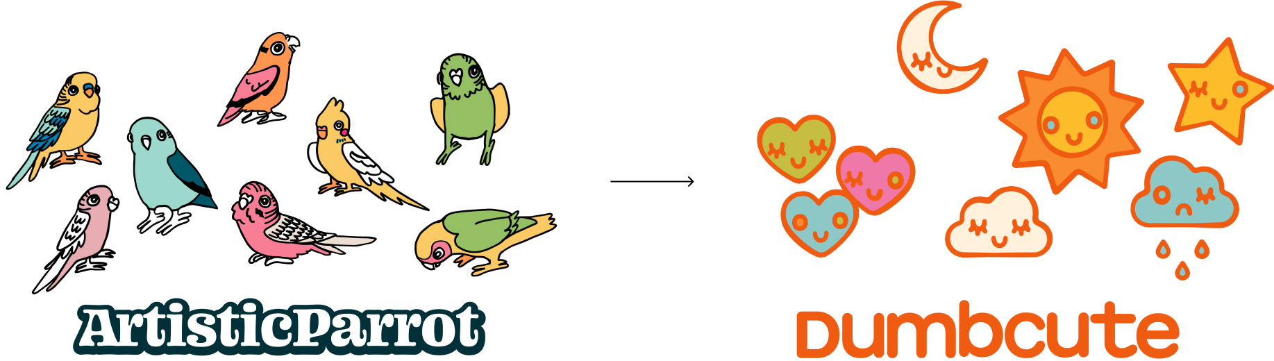
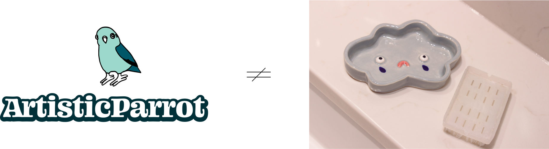
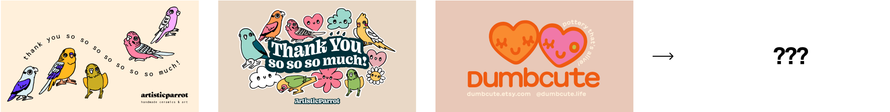
When I was in grade 7, I signed up for Instagram under the name @artisticparrot, where I would share my paintings, drawings, and design explorations with my friends and family. When I started doing ceramics at the end of high school, this became the focus of the account, and when my cupboards were full, I started selling my work on Etsy under the same name. Fast forward 5 years, and I was still using the same name “artisticparrot” as my brand, but it no longer felt like it fit. Whereas I started making bird and parrot mugs and pots, I now made mainly silly dishes shaped like inanimate objects with smiley faces. Since 2020, I had been toying with changing the name to “Dumbcute” but was too nervous.
In December 2023, I decided I couldn’t wait any longer, when I realized I was no longer excited to make pieces for my shop because it didn’t feel like ‘me’ anymore. I had a week off for Christmas and decided this was the time to revamp my shop into something I was proud of once more.
Everything must go
I frequently did brand updates, and because I love graphic design, was kind of always toying with the branding, but the general colours and imagery had remained stable for a few years. I started by trying to just update what I had yet again, but pretty soon realized I needed to go back to the foundations, by asking myself what I was trying to convey.
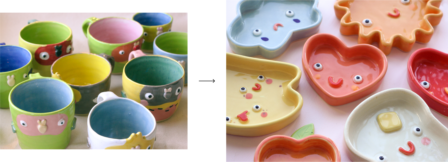
My previous approach had used a bunch of hand-drawn parrot graphics and funky font to accentuate the playful yet elegant brand identity, but it no longer suited the products I sold. My ceramic work is silly. They are good quality and well-made, but there is nothing serious about them. They are kitschy and silly because they are supposed to interrupt the seriousness of the mundane and make people smile when they notice them throughout the day.
Identifying the new brand
I listed the emotions, qualities, and attributes I wanted my work to convey, and started writing some brand statements to guide my process. My favourite of which are ‘thoughtful kitsch’ and, better yet, ‘thoughtful hedonism’ which convey that my work is the result of applying a honed craft to just trying to make life fun.
I can naturally be quite a serious person, but my artistic and ceramic work is where I get to drop my guard and have fun. I also wrote an external tagline ‘pottery that’s alive’ to capture how most of my work features cartoon faces, and isn’t just inanimate pottery, but comes to life as silly characters. The name, Dumbcute, encapsulates both of these (and if not, you can refer to the second choice tagline: ‘just look at them’).
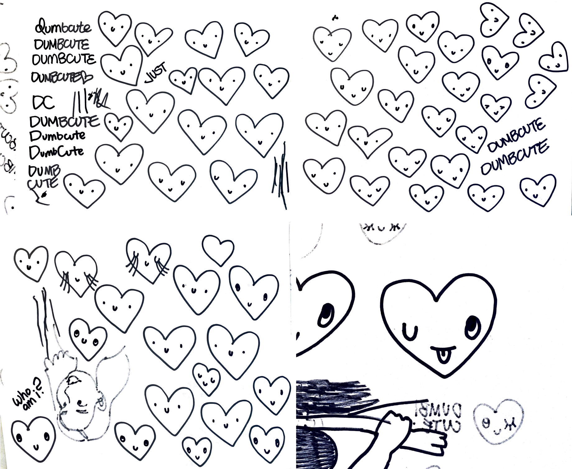
Making the logo
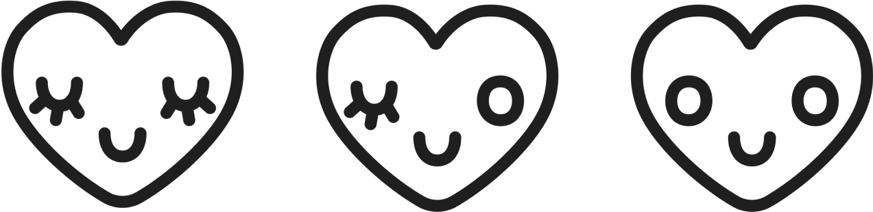
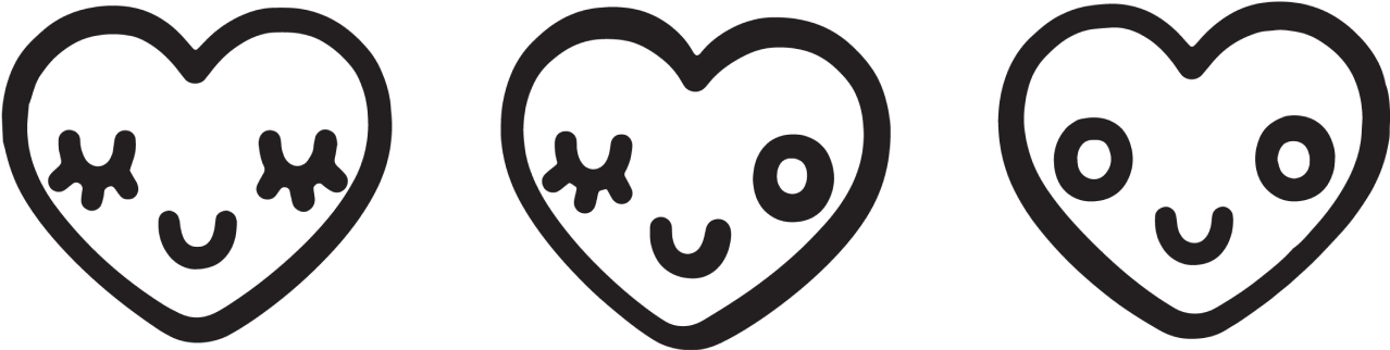
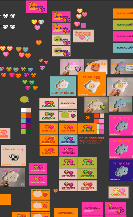
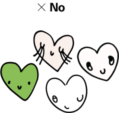
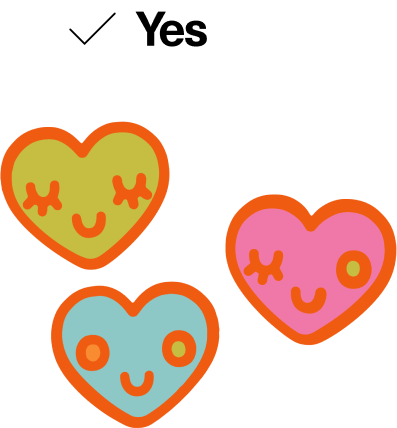
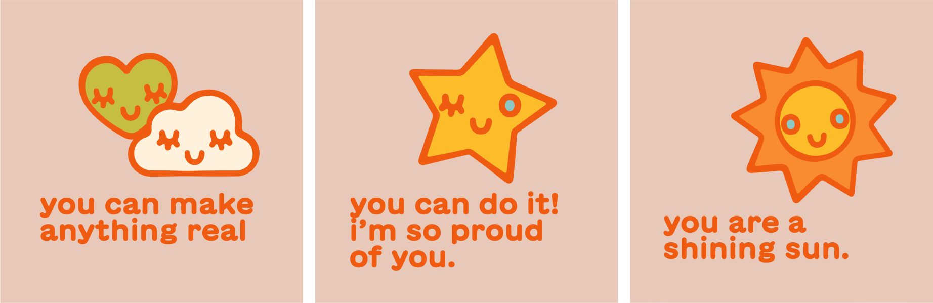
After clarifying the brand identity, I started exploring the logo design. For years I had drawn hearts, stars, suns, and such with smiley faces, so I knew the logo would be something in this vein. I tried hand-drawing characters to scan and use as a logo, but they felt too amateur and childish. That was a tension in the new approach, as I wanted to emphasize the silly and playful aspect of my work without infantilizing it.
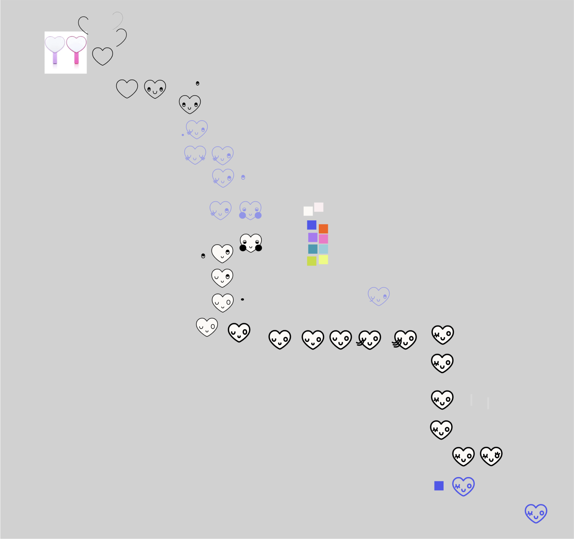
I realized that vector drawing gave a more professional effect, and added back a bit of the seriousness needed to convey the quality of my products, and ensure the brand still appealed to my key demographic of 18-45 year old women. I drew a series of heart characters which I loved, but found the straight vector graphics a bit soulless, so opened up Photoshop and used blurring and thresholds to make the outlines inconsistent width, emulating a stamped effect. This subtle change added back the warmth of hand-drawing while maintaining the professionalism of computer graphics. Have I mentioned I love graphic design? Anyways…
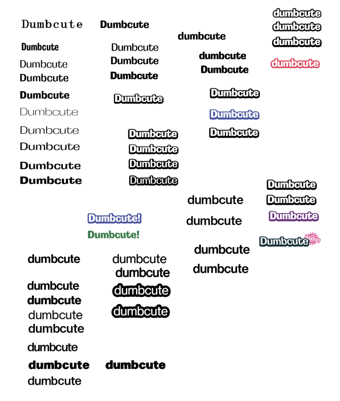
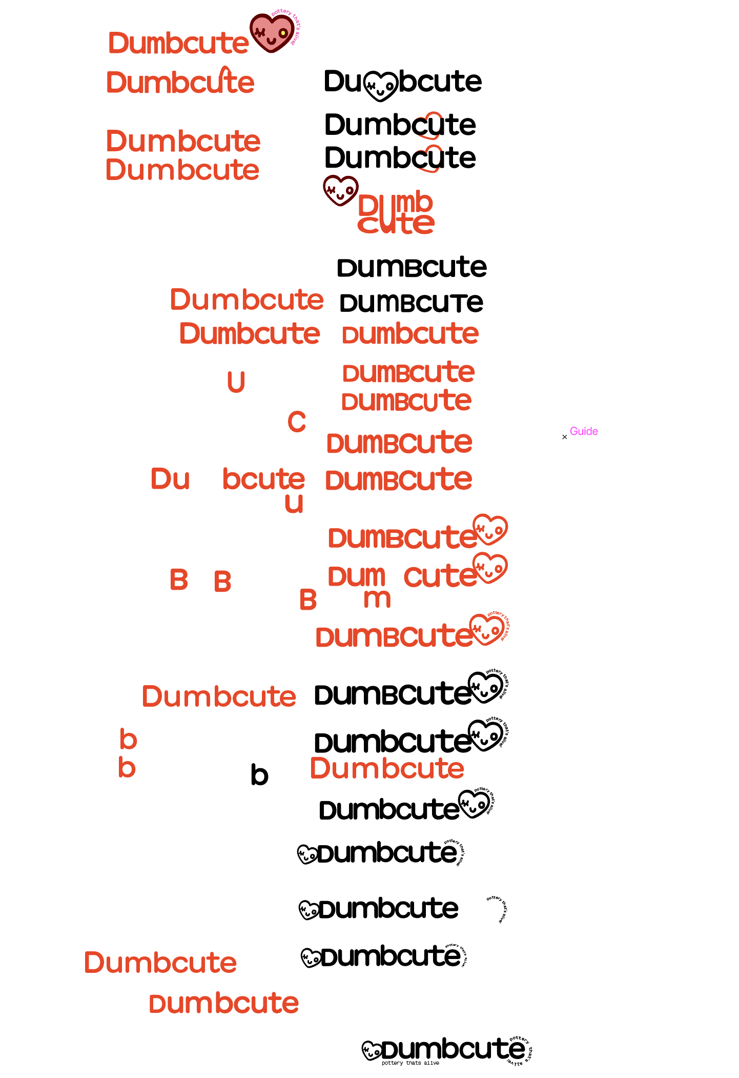
Working with type
I then moved to working with type. My previous logotype used a ridiculous font that I loved, and suited the brand perfectly, and I wanted this one to have the same treatment. Despite what one might learn in design school, there are fonts beyond Helvetica (or Neue Haas Grotesk for the real type nerds), and I understood that the identity of ‘Dumbcute’ did not call for a clean Bauhaus sans serif, but what did it call for?
I experimented a lot in this aspect, and actually struggled to find a font that suited the graphics and kept the visual continuity. I actually tried to round the corners of Neue Haas in an attempt to balance professional and playful (surprise, that was a dig on me previously), but despite trying to convince myself it was working, it wasn’t.
Colour palette interlude
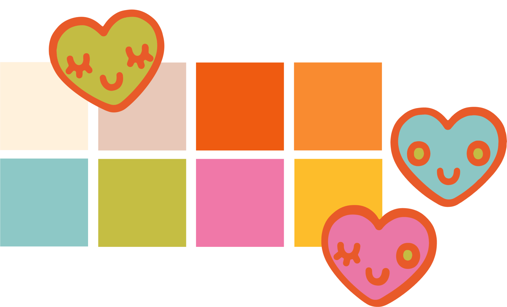
Because type was a dead end, I used what I had for now and started working with colour. I am the kind of person that loves colour, to the point where I can feel the dopamine hit when I see a pretty colour (especially oranges and pinks). Artisticparrot used muted pastels, and while I do lean pastel in my ceramic work, I wanted the branding to be bright to reflect the playful and silly part of the identity.
I started going balls to the wall with saturated reds, oranges, and pinks - my favourites - until my eyes hurt. Then, as is my usual process, I gradually introduce restraint until only the essential was remaining. In this case, that ended up being a tight palette of cohesive, not-quite-clashing bright but rich colours. I was so enamoured by the colour palette, that I was ready to tackle type again.
Type again: finding The One
Taking pragmatic approach, I listed the qualities I would want the typeface to have, and went through the fonts from my favourite foundries to see if I could find a match. Although I was initially hesitant because I didn’t like how the letters fit together, I chose GT Maru, a rounded and playful font that matched the logo graphic style perfectly. Thanks to some vector editing in Illustrator, I was able to put the letters together in a more appealing way, and mix upper and lowercase letters for more interest. Any time I can hand kern is a good time.
What happened? What does it mean?
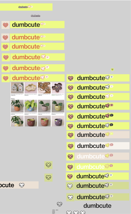
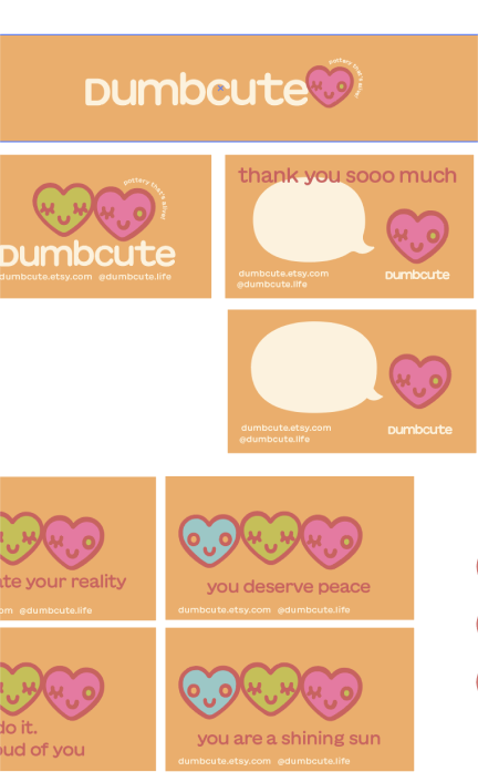
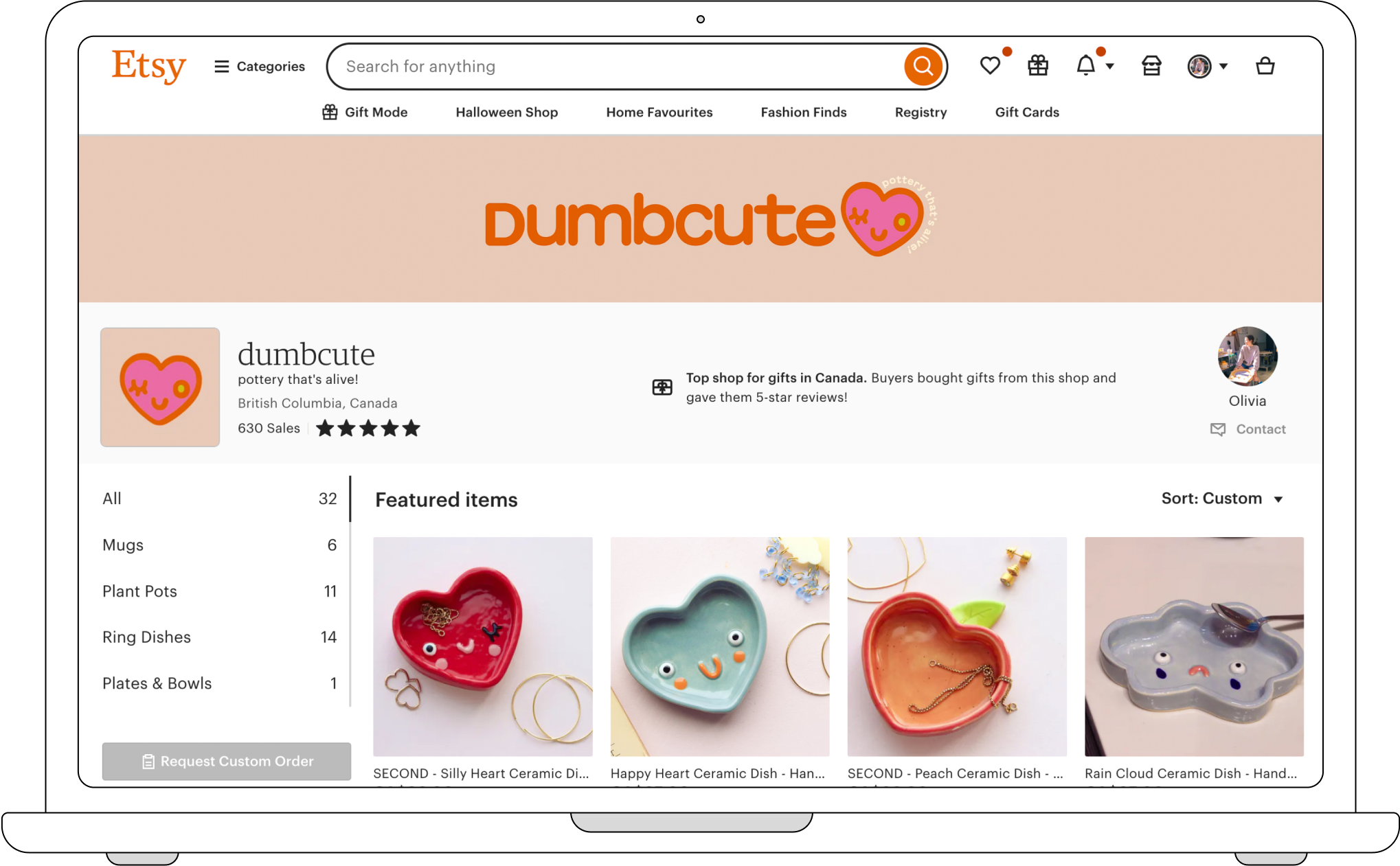
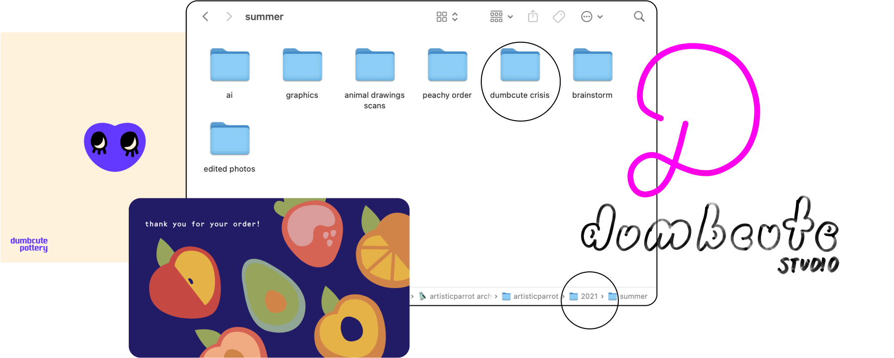
Once the logotype was done, the visuals had come together and it was time to apply them to brand assets. I made a banner for my Etsy shop, social graphic templates, stickers to include with purchases, and a new business card that doubles as a thank you card for Etsy orders. I also retook all my product photos to match the new visual approach and create a cohesive visual identity (plus I moved, and my new white walls made an excellent background).
Having sold on Etsy since 2019, I now have a better idea of what branding needs to include than I did at the start, so ensured I had all brand touchpoints covered.
I love that I was able to reflect the playfulness of my ceramic work in my branding, and established Dumbcute as an outlet for an otherwise serious introvert to have fun and be silly.
Why is it significant to you?
This project was significant because I was letting go of previous branding I had for 4+ years that I had outgrown, but I still loved and love now. As a designer, one of the hardest things is to throw away work that you’ve spent your life on, and that you love, but that isn’t accomplishing the goal anymore. Artisticparrot and the related brand and visual identity wasn’t me anymore, and I finally realized it was time to move on.
After switching to Dumbcute, I am more excited about ceramic work than I have been in a long time, and no longer feel the tension of dissonance between my ceramic work and the brand I am selling it under. I also see Dumbcute as a playground that I can explore other mediums in the same style, like silkscreen and stamp-making.
Learnings
Test concepts in multiple mediums
At the start of the visual process, I was stuck on hand-drawing the logo imagery because I thought this would be the only way to create a silly, handmade, and interesting look, but you can add interest in many ways. I ended up vector drawing and then distorting in Photoshop and in the end and much happier with the final logo than any of my many many hand-drawn drafts. It’s easy to think one method or technique will be The way to achieve a certain intention, but in reality there are many ways to approach design intent.
Change is actually a fun opportunity
As I said, it’s hard to let go of work you love that you’ve dedicated your time to, but if it feels wrong it’s time to change. Through this process I remembered how fun it is to define brand from somewhat scratch instead of working within the constraints I made years ago, so if the worst case scenario is doing that again, I’m in.
Stop waiting to take action
Now it seems ridiculous that I had been dreaming of updating my brand to Dumbcute for 4 years but never did it until now. I was nervous about redoing my branding because I liked what I had before so much (I had actually tried previously to update to Dumbcute but couldn’t made anything I liked as much so scrapped it), and when I was younger I was worried about the reception to the name change. I’m glad that I finally ripped off the bandaid though, because I immediately more excited to make ceramic work and share my business as something I’m really proud of that embodies me as a ceramist and creative.
Next Steps
Staying free
Although I love the Dumbcute branding now, I know it will have to keep changing and evolving with my work. At one point made mostly parrot pots, now I make happy dishes and pots, and who knows what I’ll make in the future. A brand is a living thing, and I realize now the value of staying flexible instead of becoming tied to one thing.
Actually sharing it
I am not the best social media marketer considering I am kind of anti social media, but I’d like to share this brand identity more to give Dumbcute a reliable and consistent identity across touchpoints. I don’t want schedule anything, but will aim to post the progress pictures I take in the studio, photos of new pieces, as I have the photos for Etsy anyways, and any sale information around holidays. The new branding does make me more excited about the brand because it feels more me and authentic, and I am now happy and proud to share my joy and passion with others.
Want to see more design work?
For more identity and branding work see my book highlight website MyTakeaway, my music project website, or read my case about the SAP documentation multimedia resource styleguide I designed. I grew up a visual artist and still am at heart so graphic design is my fun little hobby and I love nothing more than to make things beautiful.
More Projects
Data-driven technical content improvements based on UX research of SAP Analytics Cloud documentation.

Design system and technical documentation for visual and multimedia enhancements to SAP Analytics Cloud documentation.