©2025
Enriching documentation with a multimedia resource library (2024)
Design system and usage documentation for visual and multimedia enhancements to SAP Analytics Cloud Help Portal articles.

What is this?
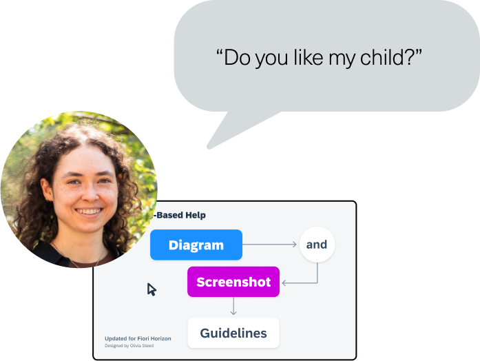
Visual style and documentation I created during a 16-month user assistance developer internship at SAP for visual and multimedia SAP Analytics Cloud Help Portal documentation enhancements. The project included guidelines, instructions, and a Figma asset library for diagram, screenshot, graphic, GIF, animated video and screencast video guidelines to be used by teams of nondesigner help writers and user assistance developers for multimedia asset creation.
What did I do?
- Updated existing guidelines for flowchart help diagrams and screenshots to match the new central brand design system.
- Created visual style and processes for simplified user interface (SUI) graphics, animated GIFs, animated videos, and video thumbnails to be used in help documentation.
- Pitched project to make unified style guide for all user assistance visual and multimedia assets.
- Created templates and documentation for nondesigner help documentation creators to make diagrams, screenshots, simplified user interface (SUI) graphics, animated GIFs, animated videos, video thumbnails, and slides.
- Published and shared styleguide, and supported help documentation creators in enablement and usage.
Why should you care?
The visual analytics product whose user assistance and design team I was a part of is very complex, and customers rely on help documentation to learn and effectively use the product. Its help documentation already used some visuals, but they took more time than writing, so most saw them as not worth the investment. In the customer research project I also conducted during my internship, I received overwhelming feedback that visuals made article consumption easier and solidified concept understanding by making articles less intimidating, more scannable, and easier to read.
The Case
Context: the product landscape
SAP Analytics Cloud is a data visualization tool that companies use to turn numerical and qualitative data into visual, understandable insights to drive organizational action. It has a public Help Portal that customers use to onboard and continuously learn new features and functions as they are needed.
Help Portal articles consist of mainly text, but topic complexity often necessitates visuals like diagrams, screenshots, and videos. When I joined, multiple contributors were creating visual content for the help documentation, but guidelines were loose and did not cover all format options.
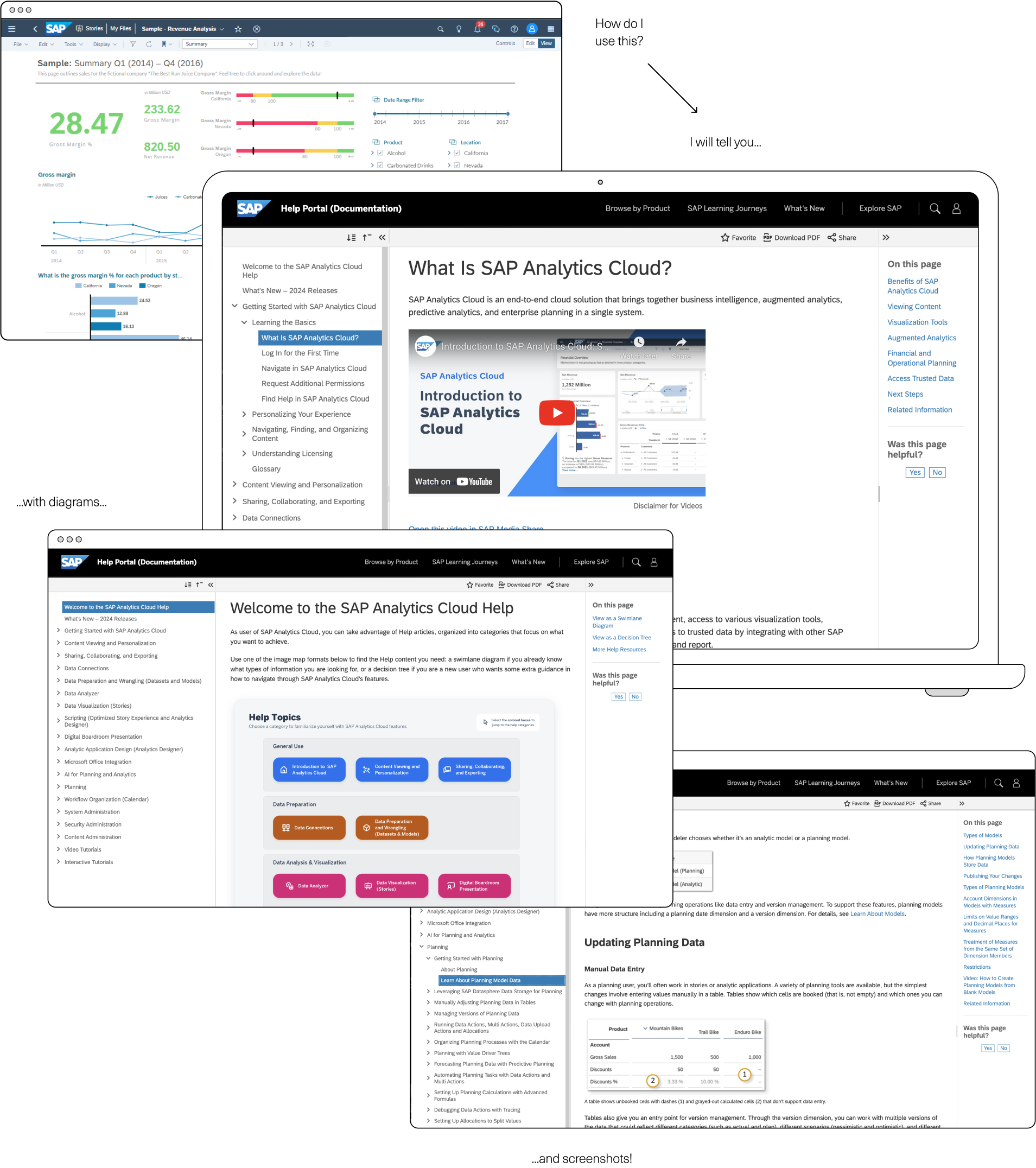
The original brief: update the help diagram guidelines
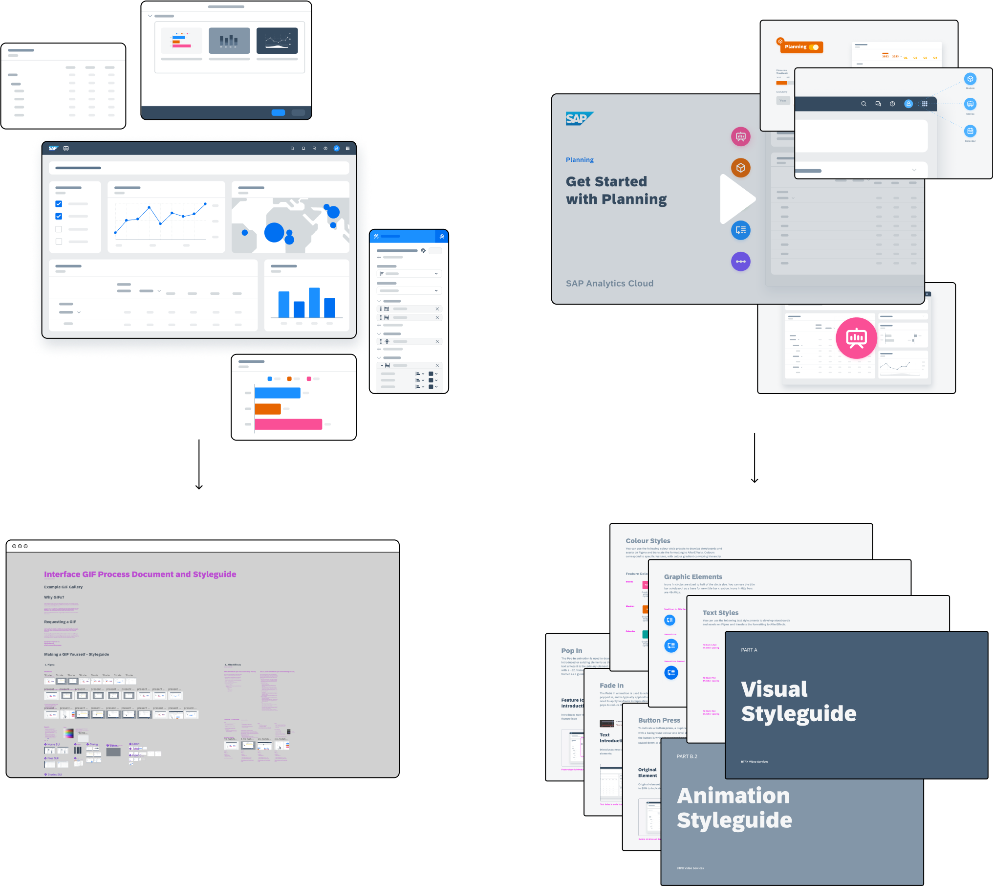
In the first weeks of my internship as a user assistance developer, I was tasked with a small project of updating the existing help diagram guidelines. SAP had recently released an update to their design system, and it was ideal that our imagery was consistent with the central brand and product design guidelines.
This seemed like an easy enough project and I got to work right away, happily messing around in Figma with the new brand colours and type. At this point, I was hungry to prove myself and wanted to make something really cool and out of the box. Most of the help diagrams were some variation on a flowchart, and I tried numerous other approaches to create more unique diagrams. However, I quickly realized that I lacked the context to understand how the diagrams were being used, and how the authors that usually made them felt about the process. I needed more information to ensure I was fulfilling the diagrams’ actual use case.

It’s time to talk to some people
I reached out to 4 of the user assistance authors to talk about their usage of the existing help diagram guidelines, and any pain points they encountered. This was an informal research method, but helped me understand my audience.
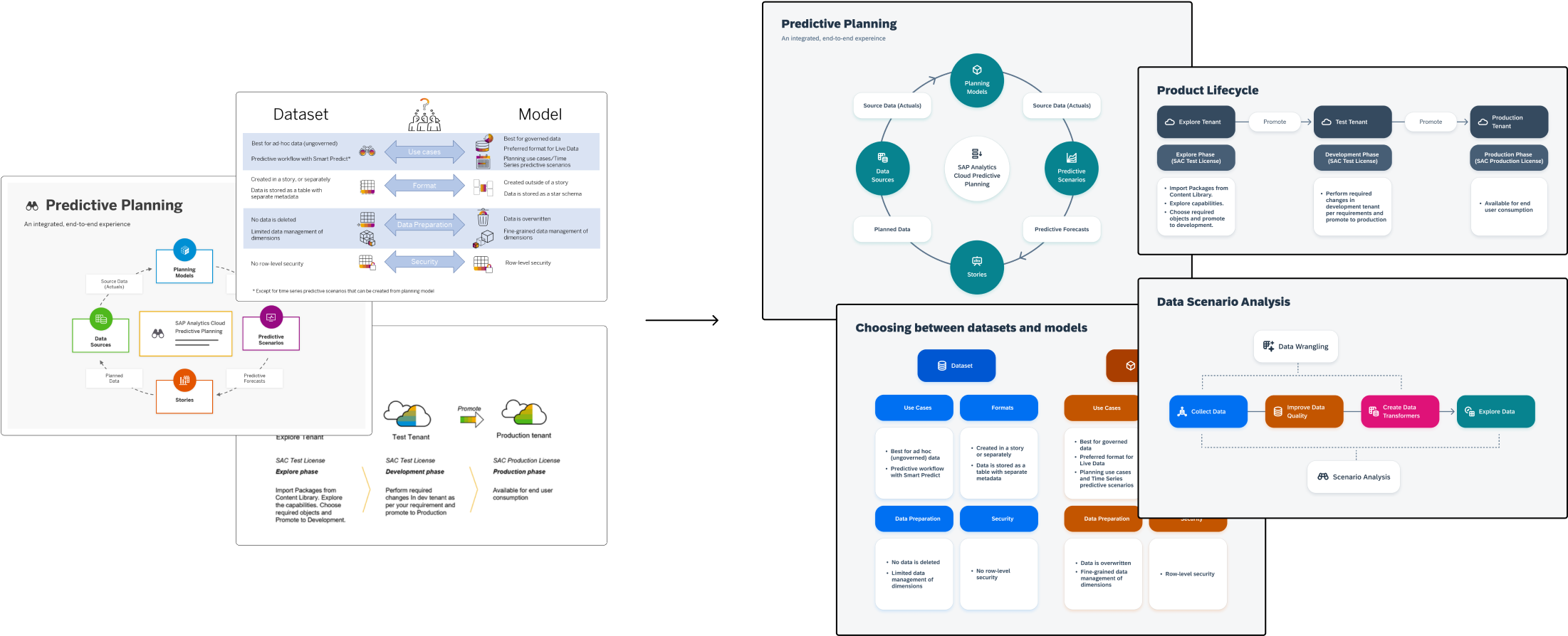
From this, I learned that the authors were nondesigners, and were intimidated by making visual content. They wanted something very ‘plug and play’ that would not depend on their skill or judgment to match the brand guidelines, and look visually appealing. This made it obvious that my out-of-the-box ‘thinking beyond boxes’ approach was completely misguided, and that the diagram components had to be as modular and easy to reconfigure as possible. Flowcharts it was.
Okay I know what they need, now to make it happen
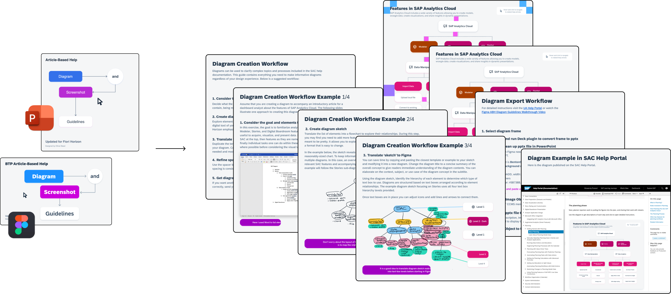
The current guidelines existed in a PowerPoint, and while trying to update them I realized that I had never in my life used PowerPoint. I also realized that after finding a home in Figma, PowerPoint felt like returning to prehistoric times, basically one step away from a command-line interface. I used Figma for the diagram design ideation, and while reviewing my work, my colleague who was a professionally trained Microsoft user (including PowerPoint!) continually stressed how Figma was so much easier and more fun to use. I thought about how the authors said it was intimidating to make visuals when they had too many degrees of freedom, and thought about how much manual work using Figma autolayout would mitigate…
I made the call to switch the guidelines to Figma, and formalized the diagram design and component updates there. I also added a significant section on how to use the guidelines, as the previous version only provided visual assets with no explanation of use case or considerations. I knew from talking to them that the authors using the guidelines were not naturally visual people, so asking them to create diagrams with no guidance was a tall order.
Explaining the why and how
To decrease the learning curve, I started the file by walking the reader through an example, from ideation, listing possible elements to include, sketching and mind-mapping, creating a rough draft in a design software, and finally polishing it by tightening the spacing and alignment. Then I included assets to copy and paste or use as a library, and ample examples to base new diagrams off of. If they weren’t such an overwhelming and stressful thing to make, authors would likely make more diagrams, which would only help our help readers. For those who were uncomfortable trying a new design software, I created a complementary PowerPoint version with all the same guidance, assets, and templates.
Because I was on a video team and had the expertise to do so, I scripted, recorded, and edited tutorial videos explaining the diagram process and working through an example, as well as sharing some basic Figma and PowerPoint tips to help educate authors and drive adoption of the new guidelines, and of diagrams in general.
I also created a complementary PowerPoint version with all the same guidance, assets, and templates to accommodate those who weren’t comfortable trying a new software.
Release and enablement
After the guidelines themselves were finished, I converted most of the existing diagrams in the Help Portal to the new design system. I also published the Figma library and shared it with the authors, and worked one-on-one for Figma and guideline enablement and to work through diagram creation together to make it less intimidating.
And then it was done (or so I thought)
Once I had finished the diagram and screenshot guidelines, converted most of the diagrams, and released the Figma and PowerPoint files to the documentation creators, I thought the project was done and moved on to the next one.
That turned out to be a prototype of a new style of animated video to explain concepts. My team was already adept at creating screencast tutorial videos explaining product features, but these videos were very procedural and did not cover the ‘why’ behind actions.
Because of my visual design skills, we were able to try out this new medium, and I storyboarded and animated most of the video (which you can watch here). It became clear during animation, however, that I needed to document what I was doing for asset creation, export, and animation so that my colleagues could help animate sections, and so that the style would be sustainable after my internship ended and I returned to university.
I made a styleguide covering the Figma asset creation and export, and all the animation conventions I used in AfterEffects, including example assets, files, and detailed written documentation. To match the new central SAP design system, I also made a new video thumbnail template to use for this video, and update previous and subsequent videos.
Doing the same thing again (and again)
For the animated video, I created and used simplified user interface (SUI) graphics to explain concepts while keeping content accessible, keep focus only on relevant areas, and increase video longevity (the product is updated every two weeks so the interface specifics are always changing). My team began to question if these SUI graphics would also be useful in the help documentation for the same reasons, so I created a library of SUI graphics including one for every major screen and interaction of the product, and of key widgets and panels.
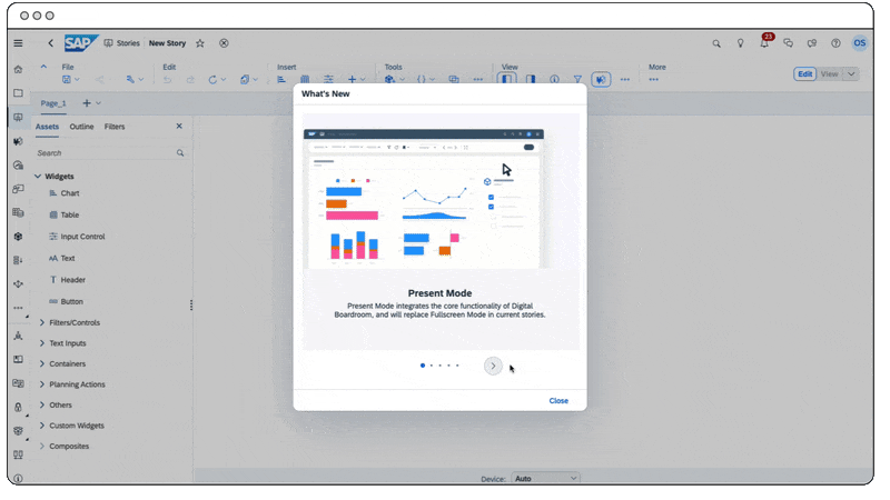
Also, while working on the animated video, someone on my team asked if I could animate a short GIF to show new features in an updates release carousel in the product. This sounded like a cool opportunity to have my work published in the product, so I modified some of my SUI graphics to illustrate the new features, and animated them into a few short GIFs to accompany each carousel page.
After working on this, I realized that GIFs seemed like a great middle ground between videos and screenshots, which addressed the user research feedback I was gathering at the same time that people wanted visuals but they also wanted speed, and videos were too long to commit to. At the same time, not everything can be adequately explained with screenshots, and more complex or long interactions would need multiple screenshots which would take up a lot of screen real estate, making articles longer, and more overwhelming. It seemed then, that GIFs would be useful in articles too to condense information into a short, scannable visual.
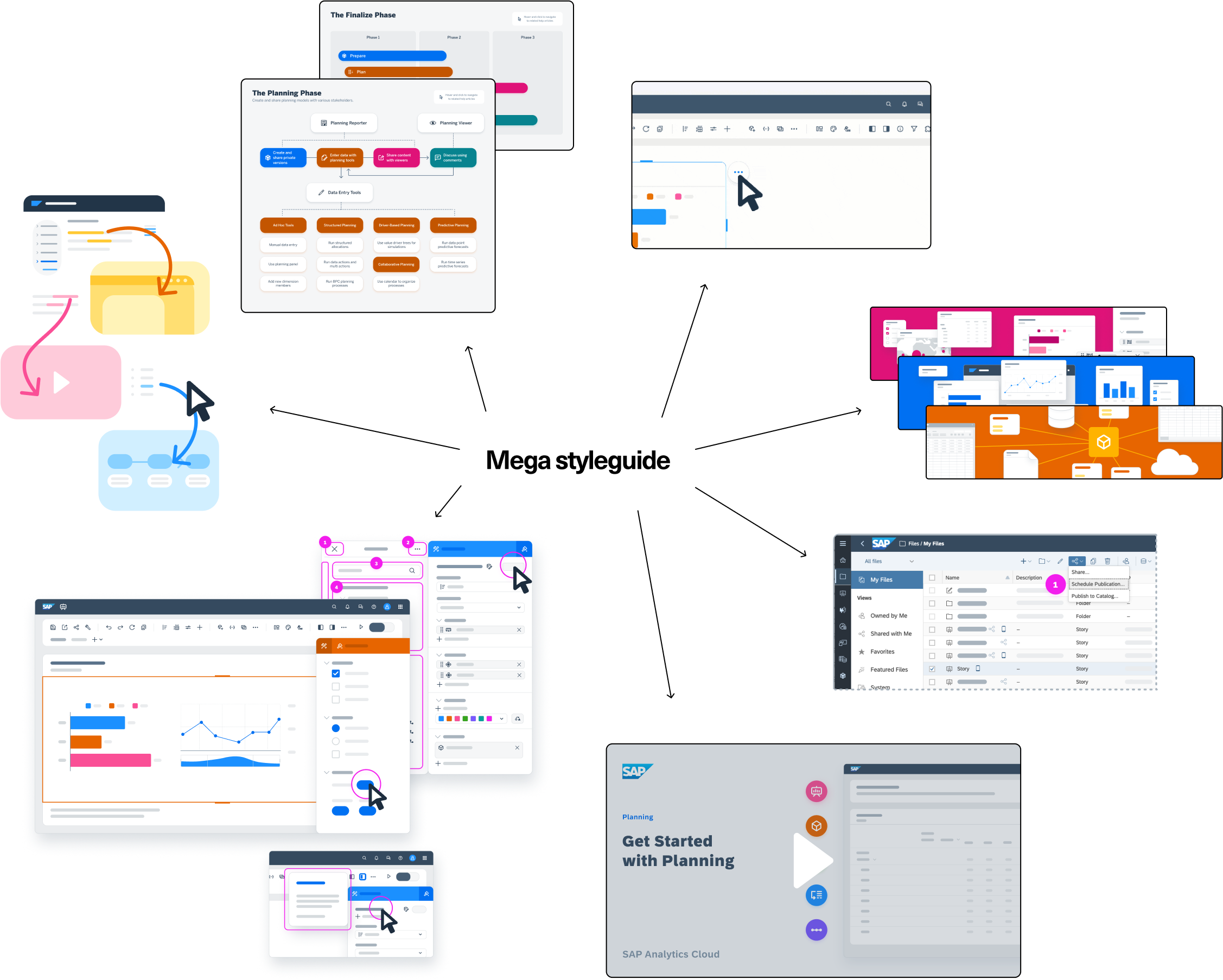
Dawn of the mega styleguide
In my concurrent ongoing user research project about the help documentation, once of the key pieces of feedback was that SAP offered too many resources, but there was no central place to access them, so people got confused about what there was to access and how to find it, ending up with lists of bookmarks to different disparate sources. I could relate, because my experience navigating files in Figma was similar. I was growing the amount of UA multimedia and visual-related files I made, but unless I kept all my tabs open at once, it felt like they were lost in the ether.
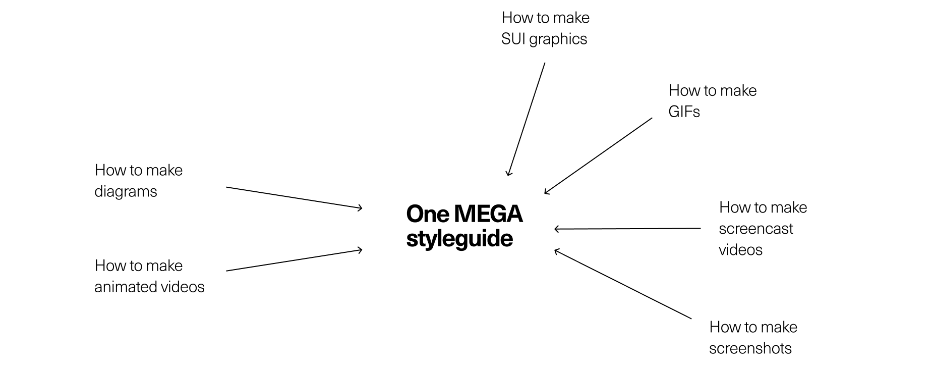
It suddenly seemed very obvious that I should make a Mega Styleguide including all of the visual and multimedia help documentation enhancements that I had worked on thus far. It would include directions and assets to create diagrams, screenshots, SUI graphics, animated GIFs, screencast and animated videos, and video thumbnails, and it would all be explained and easy to use for the nondesigner documentation creators, and for my team once I left, as I had picked up making most of the visual and multimedia content.
Pitching the project
I had a lot of leeway with what I did in my internship, but I didn’t want to be allocating a large proportion of my time to something without support from my team and manager first. I hunted down the styleguide files I had made thus far and showed my manager and supervisor, pitching the project to make a unified asset library with accompanying documentation. This would make it accessible for anyone to make visual and multimedia
Thankfully, they both loved the idea, and shared that other teams had seen our animated video prototype and wanted to use the same style, so this would be useful even beyond my immediate colleagues for the whole Data and Analytics Design organization to create unified multimedia and visual content.
Making the masterpiece (unbiased description)
Now that I had support from my team, I could go ahead and dedicate some time to my new pet project. I honestly intimidated by how much I would have to cover and explain in the guide, but all I could do was start.
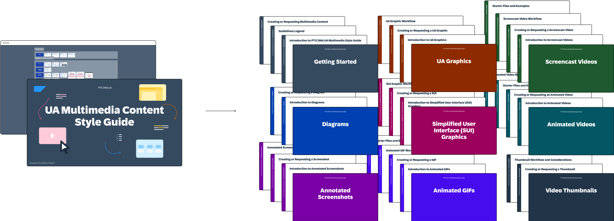
I made a master Figma file with a page for each resource type, and included an introduction and explanation of what each resource was and when to use it, a written and visual example walkthrough of making the resource, assets and templates to use in creation, and a gallery of examples.
As I finished resource sections, I was informally testing the content on my three team members as we worked on subsequent projects involving visual and multimedia content creation, to ensure my instructions were understandable, and adjusted accordingly. I then published the guide on our company Figma so anyone could make use of it, and shared it with my team.
What happened? What does it mean?
Although it took a long time to develop, write, and design everything included in the style guide, it proved to be a very valuable resource for my team, and for myself during the remainder of my internship, and increased the amount of visual and multimedia content we were able to produce.
Because our projects were always changing, I would go for months without making a video or GIF, and then suddenly would be making them every day depending on the need and requests from other teams. The guide proved to be a very valuable resource after months of not making an animation or GIF, because I knew exactly how to make them consistent, and even had a step-by-step workflow example to jog my memory. This saved a lot of time having to relearn the format conventions each time I made something new, and helped my team get more involved in creating visual and multimedia content as well.
An unexpected outcome of the guide was that it did a great job of advertising our services as a design team. Of course, there are directions for people to create their own content, but my team already performed on-request user research and screencast videos, so adding visuals and animations was not out of place, and we enjoyed the work. As a result, the guide can also be used as a brochure showing the full spectrum of visual and multimedia services we could offer.
Later in the internship, we even got to make an animated and screencast video for the president of Analytics and HANA Database organization to pitch a new AI product offering to the board (the highest level at SAP!) because of the increased exposure to our services brought about by the guide.
Lastly, the guide ensures that the new visual and multimedia work I did during my 16-month internship to improve the help documentation can continue thanks to my amazing team.
Why is it significant to you?
This project was significant because it was self-initiated from inception to completion. I saw the opportunity and took initiative to make a new project, marking a turning point in my internship where I finally felt confident enough to take action when I saw gaps in our processes. After the guide, I continued to make and share process documents where I saw issues, including for video requests, and team-specific intern onboarding.
Learnings
Make your own projects
Going into my internship, I definitely had an ‘I’m just an intern’ attitude, and expected to be told exactly what to do, as surely nobody would trust my judgment. That was not my experience at all. From my first week, I was given tasks to own myself, and nobody was micromanaging me to make sure I was progressing – it was all up to me. This amount of autonomy was such a gift, because it allowed me to grow my confidence and take myself seriously, which reflected in the increasing amount of self-initiated work I took on.

Lift others up
I love visual design and my team at SAP knew that, so when I started at my internship I took on more and more of the visual component of user assistance. I was having fun and so were they, but at a certain point realized that I would not be here forever, and didn’t want the progress we had made on improving the help documentation to stop. My manager had mentioned that the step from junior to senior designer is when you stop focusing only on personal growth and development, and consider also what you can do to help others grow and develop themselves.
I didn’t want to be irreplaceable because that would mean a huge loss when I inevitably left to return to university, so formalizing my processes into guidelines means my team could learn how to get involved with visuals, and how to continue after I left.

Next steps
After publishing the mega style guide, I shared it with authors for their own use, which was met with positive reception.
After my contract was up in August 2024, my team continued making the visual and multimedia content I did by request as well, for use in help documentation, product update carousels, informational popups, and other touch points requiring user assistance visuals.
What else should I look at?
For more user assistance and information design work, check out the user research project I also did during my SAP internship. For more visual design check out my personal ceramics business branding project.
More Projects
Data-driven technical content improvements based on UX research of SAP Analytics Cloud documentation.

Personal ceramics business brand identity and visual presentation overhaul.