©2025
Quest for the ideal help article (2024)
Updating SAP Analytics Cloud help documentation guidelines and articles based on secondary and primary user research to better meet customer goals and expectations.
What is this?
Large-scale user research project I led as part of my 16-month UA Developer internship at SAP to gain insight into customer attitudes and experience of help documentation, aiming to improve help experience through content and formatting interventions.
What did I do?
- Designed UX research study with customer interviews and survey.
- Moderated 21 user sessions (interview, task-scenario, AB testing, hands-on exploratory workshop) including internal and external participants.
- Synthesized research data into overview report, and presented report findings to global SAP Data and Analytics Design organization of over 100 people.
- Prepared targeted reports about specific opportunities for key stakeholders, and successfully initiated 3 offshoot projects addressing and capitalizing on findings from different angles (including one to include help documentation search in central SAP-wide AI assistant MVS).
- Created new article formatting and content recommendations based on findings for UA authors to follow.
- Restructured, rewrote and designed visuals for proof of concept articles based on recommendations to be used as examples for UA authors.
Why should you care?
Help documentation is a key component of perceived product usability, especially for SAP Analytics Cloud, a very complex analytics software, about which the key complaint in leading industry reports is inadequate help resources. This means the single biggest effect we could have on customer experience of usability is not in the product at all, but through improvements to the help documentation.
The Case
Setting the scene - meet the product
SAP Analytics Cloud is a data visualization tool that allows strategic and directorial members of companies to transform raw data into consumable, actionable visualizations, driving change within organizations. Data-driven decision making is becoming increasingly important in large organizations, and SAP Analytics Cloud is positioned to help businesses achieve this.
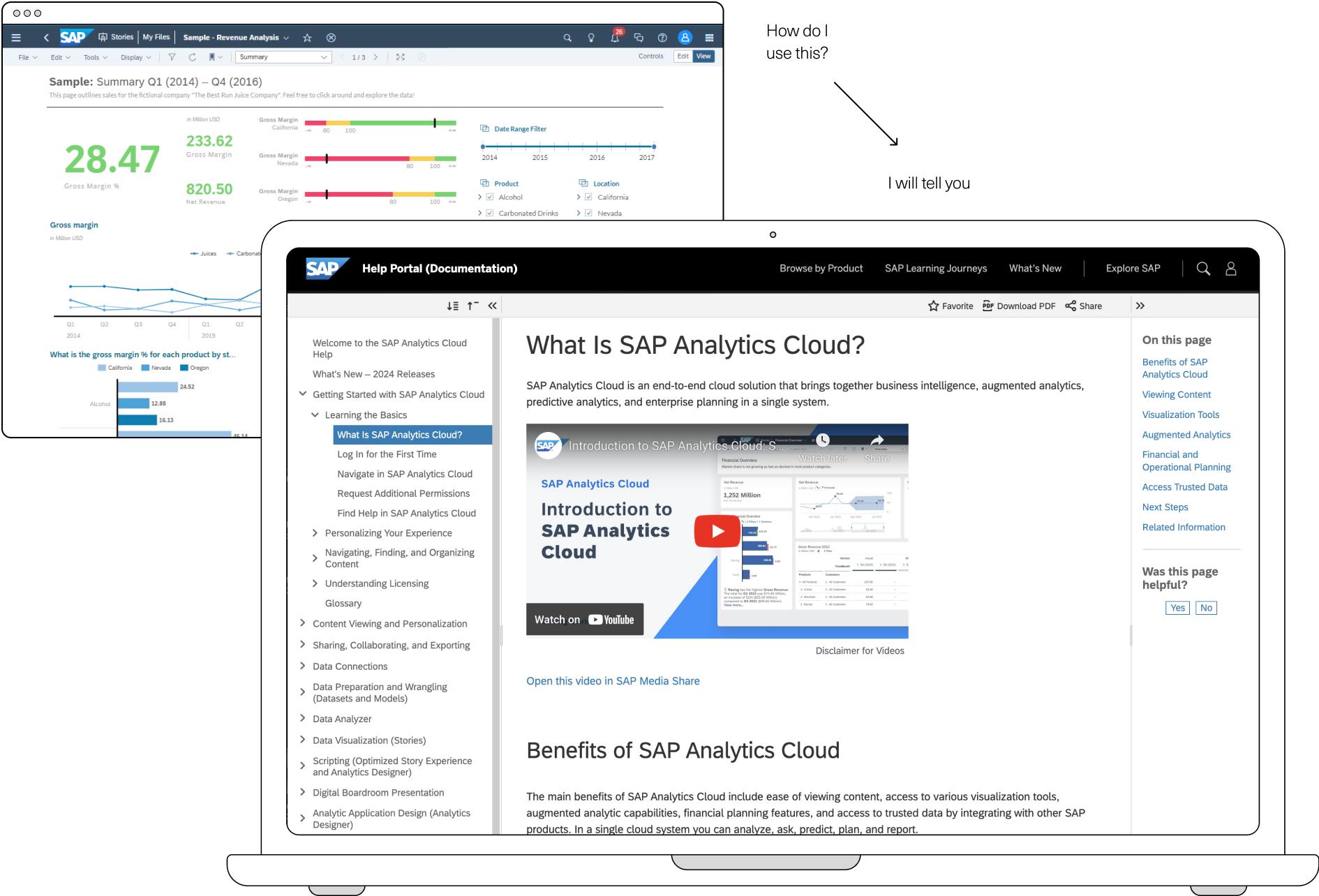
SAP Analytics Cloud has a public Help Portal with documentation on how to use the product that is periodically updated with each quarterly release.
The problem - too many articles, not enough information
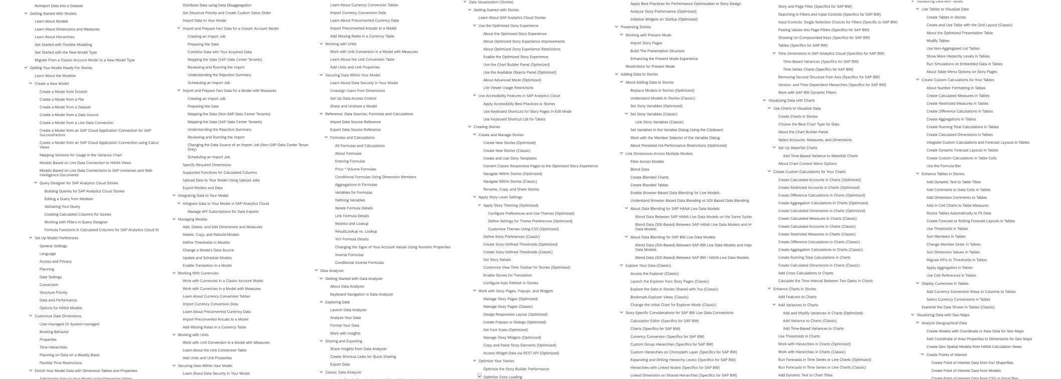
Software changes fast, and the SAP Analytics Cloud Help Portal has over 2000 (!!!) articles, so inevitably content gets out of date. When I joined the team, there had been a previous effort to improve the navigational experience of the Help Portal, but the existing guidelines for article content were unclear, and had not been tested with user research. This led to inconsistencies between articles in different help sections.
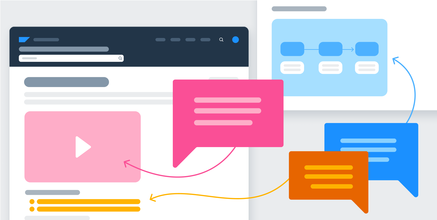
Multiple teams were trying to improve the documentation with visual and multimedia enhancements, but nobody knew what format (eg. video, click-through tutorial, diagram, screenshot) people found the most useful, so we weren’t sure how the limited resources could be used the most effectively. Considering the reputation of extreme complexity that the product has, and the overwhelmingly negative reception of help articles gauged in unrelated customer interviews and online communities, it was time to address the elephant in the room and embark on the quest for the ideal help article.
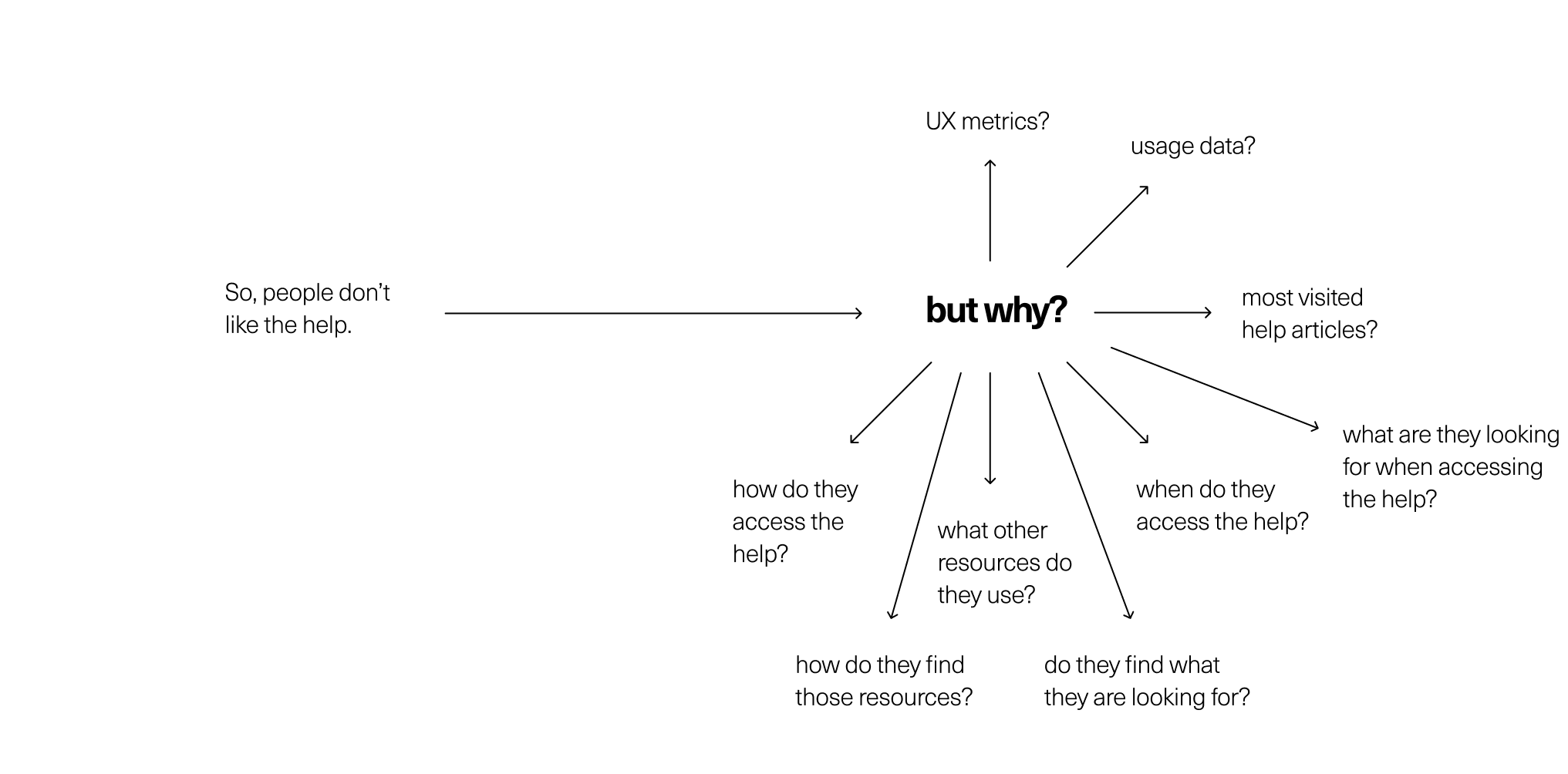
Defining the problem - what are we trying to accomplish?
I had expressed interest in user research work, so was given the reins to lead an undefined research project to learn more about how people are using the Help Portal, and what media formats they preferred. This would be used to guide where we invested resources, and culminate in updating the article guidelines to increase consistency and usefulness across the Help Portal.

Desk research - what do we already know?
Before too much planning, I wanted to learn everything we already knew about the reception and attitudes towards the Help Portal, and the usability of SAP Analytics Cloud, so I wasn’t collecting redundant data.
I scavenged and asked for Help Portal page visit metrics, product UX metrics, product usage tracking data, and at the same time took online courses on information architecture, user research methods, user assistance, and technical writing to familiarize myself with the domain.
I also shadowed a user researcher to get a better idea of session moderation and study design, which allowed me to practice notetaking and preparing the findings report with researcher feedback.

Designing the study
Once I learned what we did know, it was time to identify what we wanted to know, which mainly included how people interacted with various SAP help touchpoints, how they consumed help, if it was meeting their needs, and what kind of format they were looking for.
I decided to do a set of customer interviews to observe behaviour and gather in-depth qualitative data, and then distribute a survey to a wider customer base to gather quantitative data to back up anecdotal interview sentiments.
I wrote a session guide and survey, and worked with research and customer representative colleagues across the company to recruit customers.
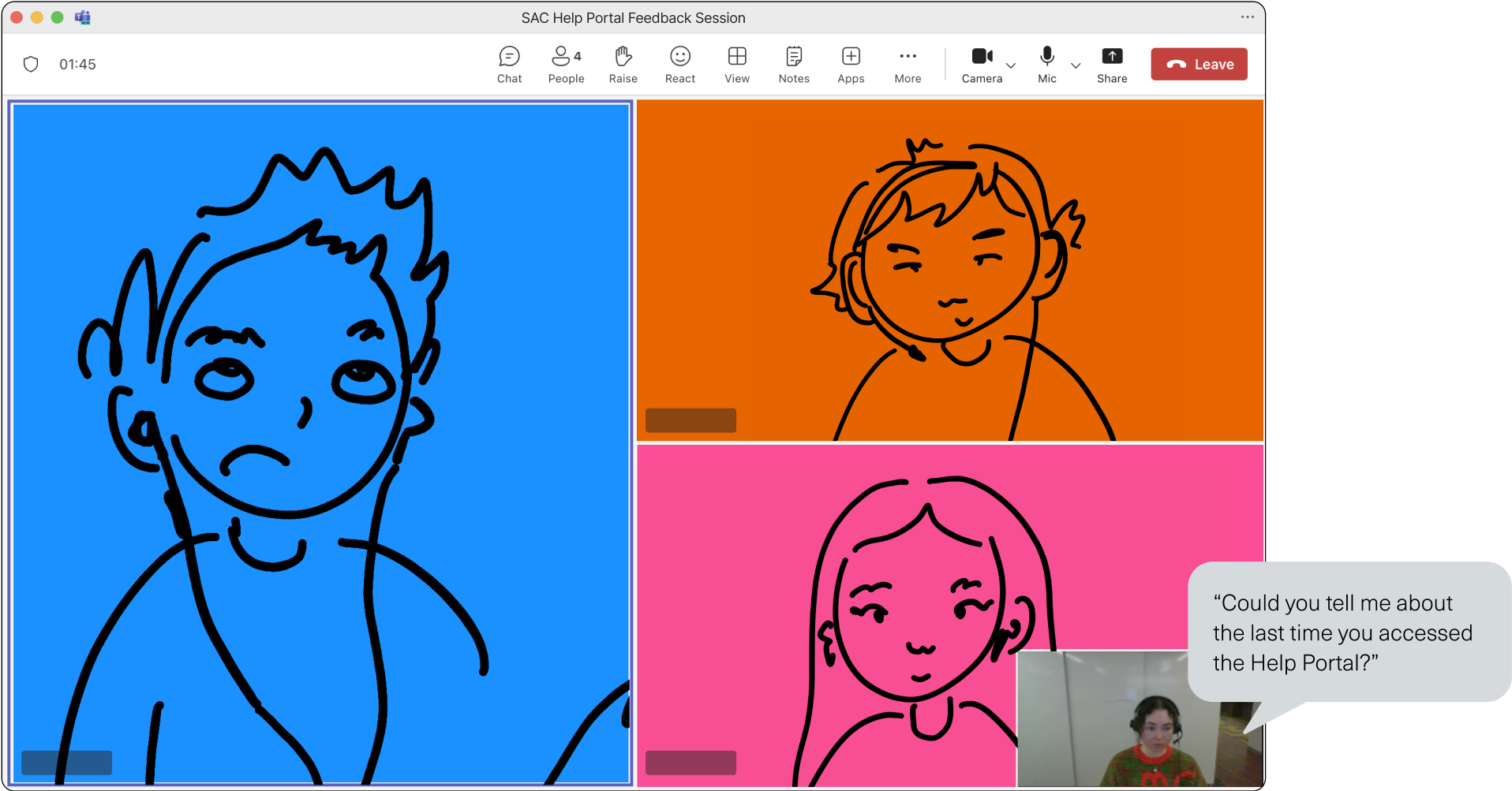
Conducting the study 1 - interviews and exploration
In the first round of research, I moderated 5 customer sessions with 14 total participants, guiding them through two task-scenario questions so I could observe their typical help-seeking behaviours, and then conducting an open interview to gauge format preferences and usability assessments.
Although I was nervous, this was actually very fun and I loved the experience of speaking directly to customers around the world, and learning what their day-to-day help usage was actually like (even though they were at 5-6am to accommodate global timezones!). I also shared the survey with customers to get a broader sample of product users.
During the sessions, it became clear that mainly administrator and power-users were responding to the research request, so our data was skewed towards technical use cases. At the same time, recruiting was harder than I anticipated, as customers prefer to participate in feature-based research that gives them the impression of product influence. This was a problem, because as much as it’s ideal to be data-driven, insufficient data cannot be trusted to draw universal insights. To get more participation at a beginner and intermediate level, I decided to open up the session and survey research request to internal users of our product, and conducted 3 more sessions of internal user groups.
Synthesis and reporting (brain spaghetti time)
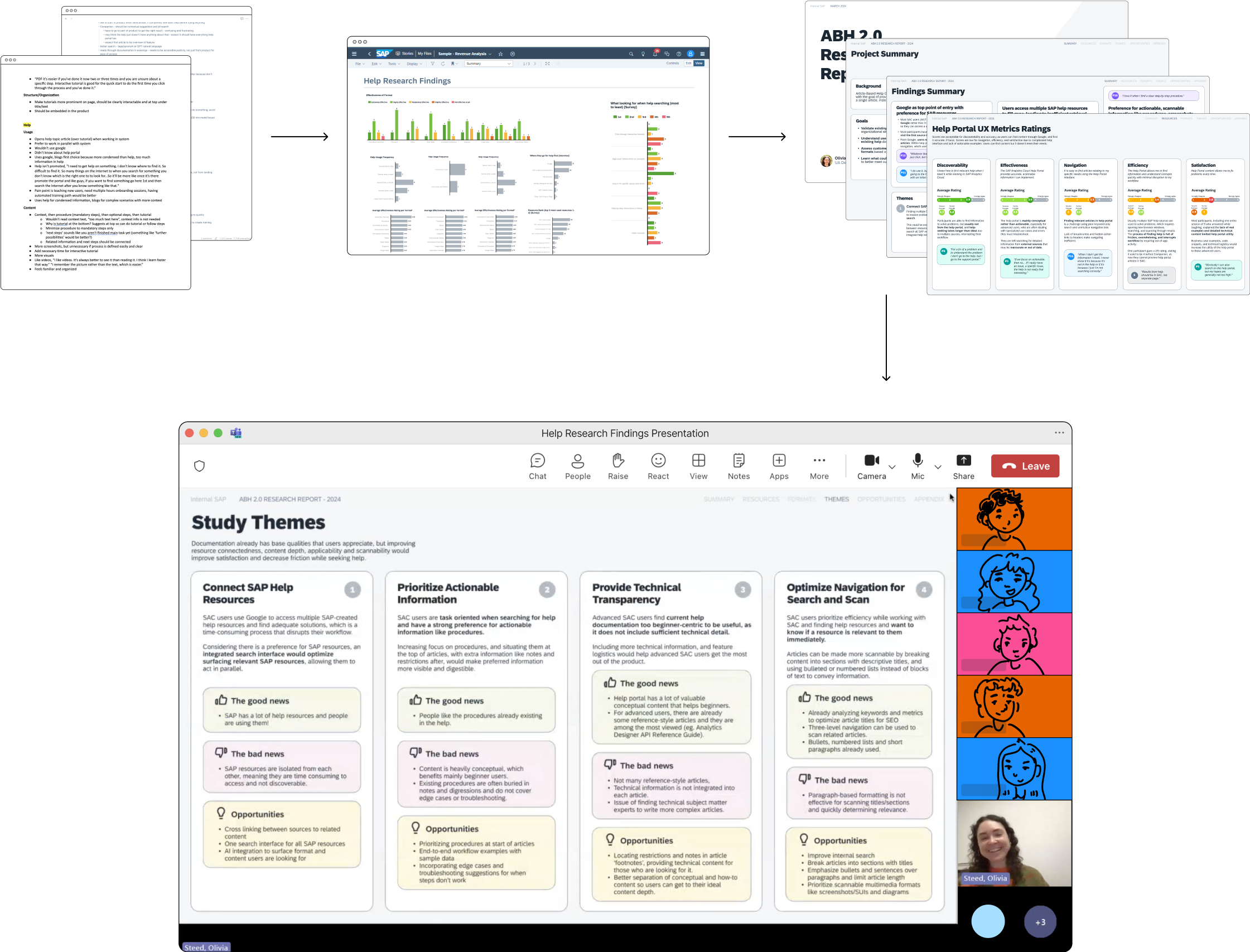
I invited members of my team to take notes during sessions so I could give my full attention to moderation, and reduce bias and missing things in my own findings. Then at the end of sessions I had written a summary of the key painpoints, insights, and opportunities, and discussed with the team to sync on key takeaways. Plus, I had recorded every session and had a text transcript of each as well. All of this is to say that when I was done sessions, I had a lot of data to sort through to make the report, and wasn’t sure where to start.
The researcher I shadowed used Excel to take notes, and I had seen most UX designers using the classic sticky notes on FigJam, but neither of these methods clicked for me. After some trial and error, I ended up condensing the notes for each session into a Word document colour-coded by company. I then grouped notes and relevant quotes by question or topic area in another document, where I could identify which company they came from based on colour. From these grouped bulleted insights and quotes, I was able to summarize the findings into 4 key themes, and provide recommendations with the data and quotes to back them up.
During the data analysis process, I used SAP Analytics Cloud to visualize the findings data, and it became clear that the session and survey data were not exactly one to one, as the survey used a lot of ranking and numerical scale questions, whereas sessions were more qualitative, with the same data being gathered in a less numerical way. This made the data difficult to combine in it’s original state, so I worked with a team member to manually clean and model data so it would align, and could be shown together in one chart. This was a great opportunity to see the use of analytics in action, as the charts made findings obvious immediately, whereas the text data had taken hours to synthesize, and taught me to consider how I will be analyzing the data before collecting it!
To share the findings, I created a slide deck report in Figma with top line findings and quotes, plus an extensive appendix with specific information on formats and resource attitudes for future reference. I presented this findings report to SAP’s Data and Analytics Design organization of over 100 people, including design and organization leads, in two sessions for different time zones.
Now what?
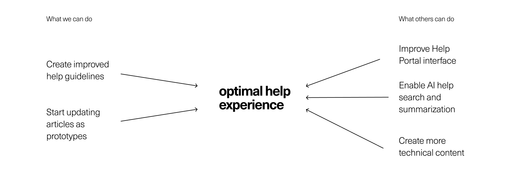
The reception to the report was very positive, so to capitalize on the support we had for the time being, I divided the improvement opportunities into buckets of what was in and out of my team’s control.
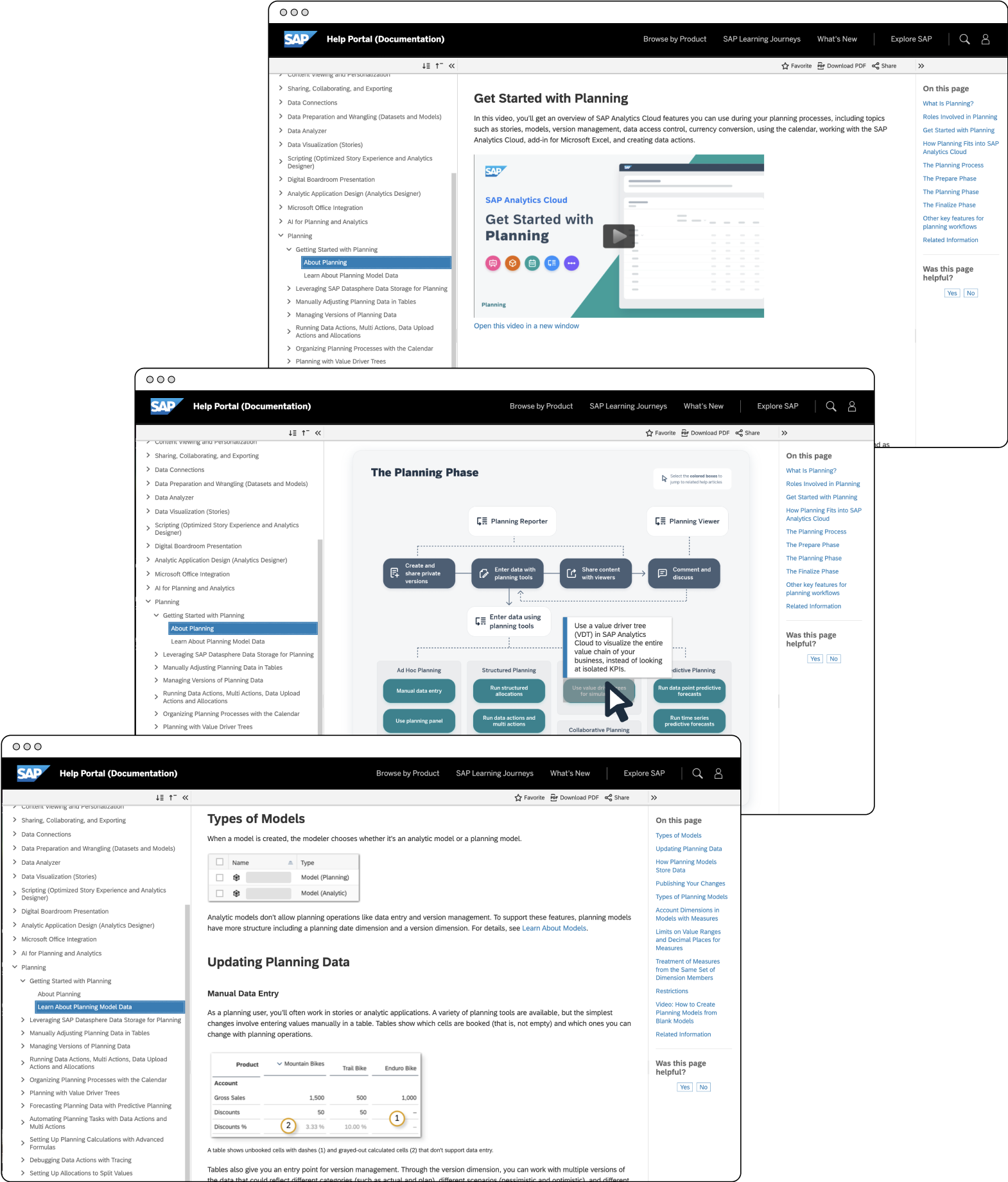
In our control was updating the Help Portal writing guidelines to include article formatting and content inclusion recommendations based on user feedback. To do this, we would need to know for certain which article format and layout users like best, so would have to start experimenting with proof of concept articles to test our new approach.
Out of our control, but in our influence, was improving the findability of articles with better search and an improved Help Portal interface, and increasing the amount of help content produced by involving other subject-matter experts within the organization. To make the case for each intervention, I would need to prepare and present recommendations to specific stakeholders and ask for their participation.
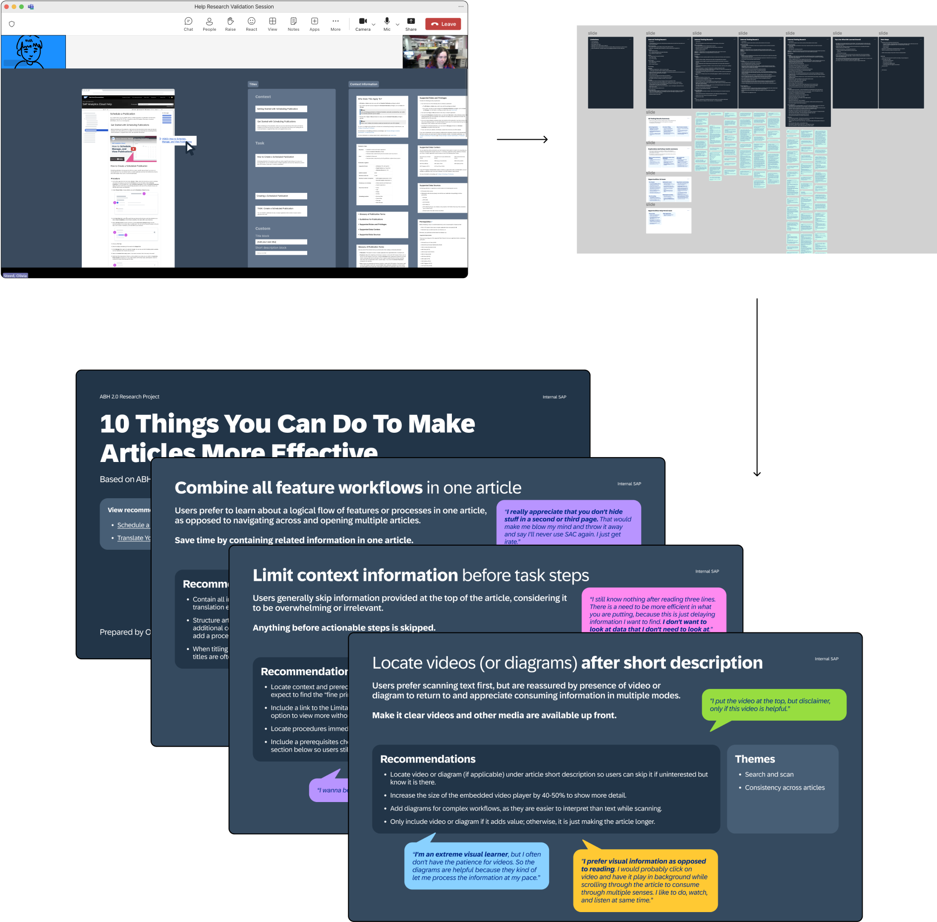
Conducting the study 2 - validation sessions
To test the new approach we were recommending, my colleague and I each redid select articles with reimagined ordering, layout, and content based on user feedback. We tried several approaches, and when we couldn’t decide which made more sense, it was clear we needed more data.
I wrote a session script, and scheduled and moderated 4 rounds of internal validation testing, totalling 13 sessions. These included AB testing of different naming conventions, content ordering, and information design.
In the first two rounds, sessions were impression tests comparing article styles to get a general sense of preferences and assess things like naming and ordering. In the second two rounds, participants were given tasks scenario in which they had to find specific information to test what actually improved article usage in practice. Good thing we did this, because the collapsable tabs everyone said they loved did not work at all in practice! This project taught me that people do not know what they want or mean what they say. Most complaints were about usability, not aesthetic appeal, so it was important to properly assess both aspects of articles.
I also conducted an exploratory workshop as part of sessions where participants were provided all article components cut up in Figma, and were asked to drag the elements they found useful into an article frame in their ideal order while talking through their thoughts. This helped us understand what people actually wanted, and why they had the opinions they did about different resources.
What happened? What does it mean?
Formalizing new guidelines
After conducting validation testing sessions, I synthesized the data and created a mega report containing the themes from all of the research findings, along with 10 recommendations for better help articles based on user feedback.
With my colleague, I rewrote three sections of the help documentation to test the applicability of recommendations across contexts and article types to see what we were missing and hone recommendations accordingly.
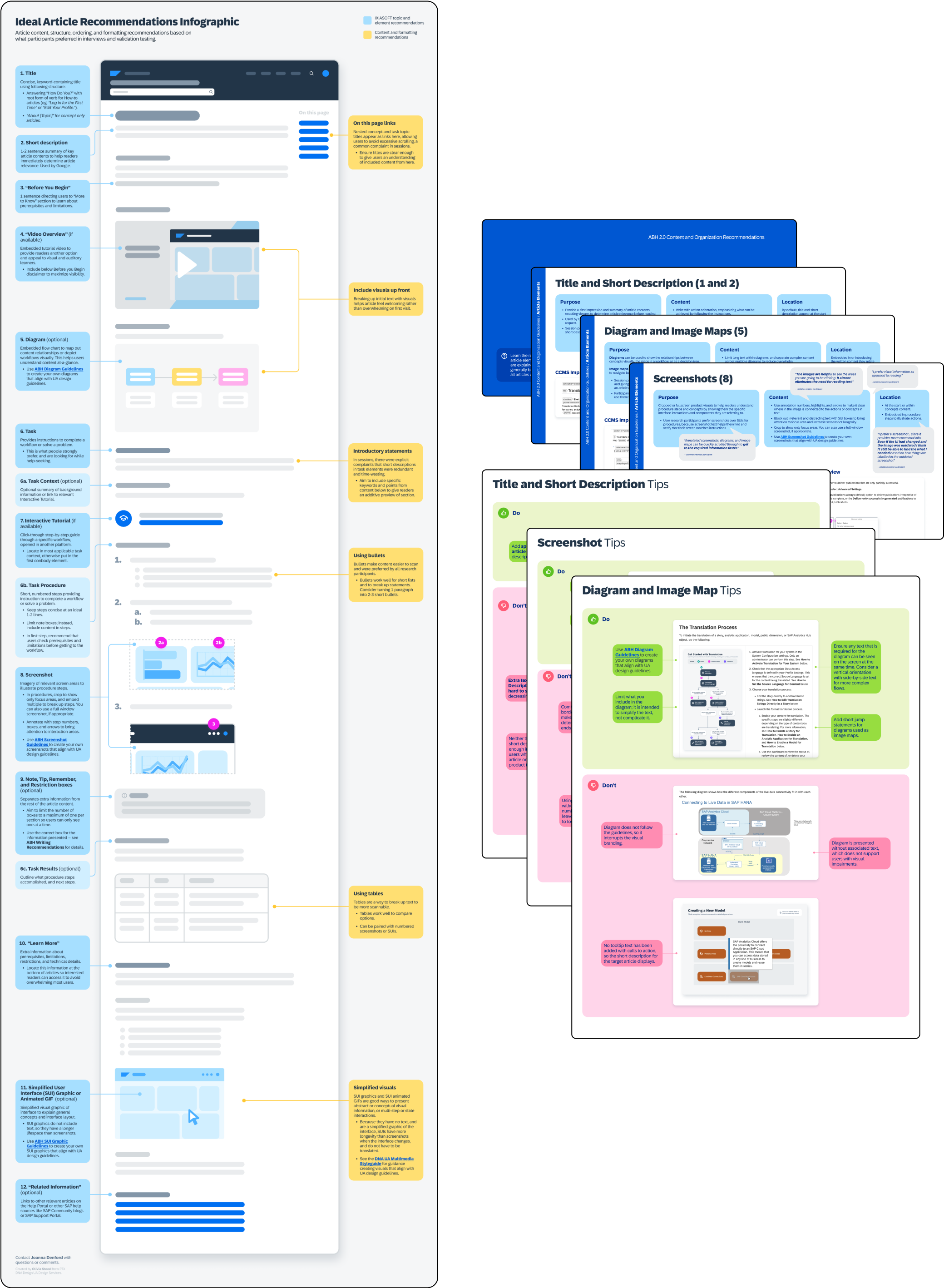
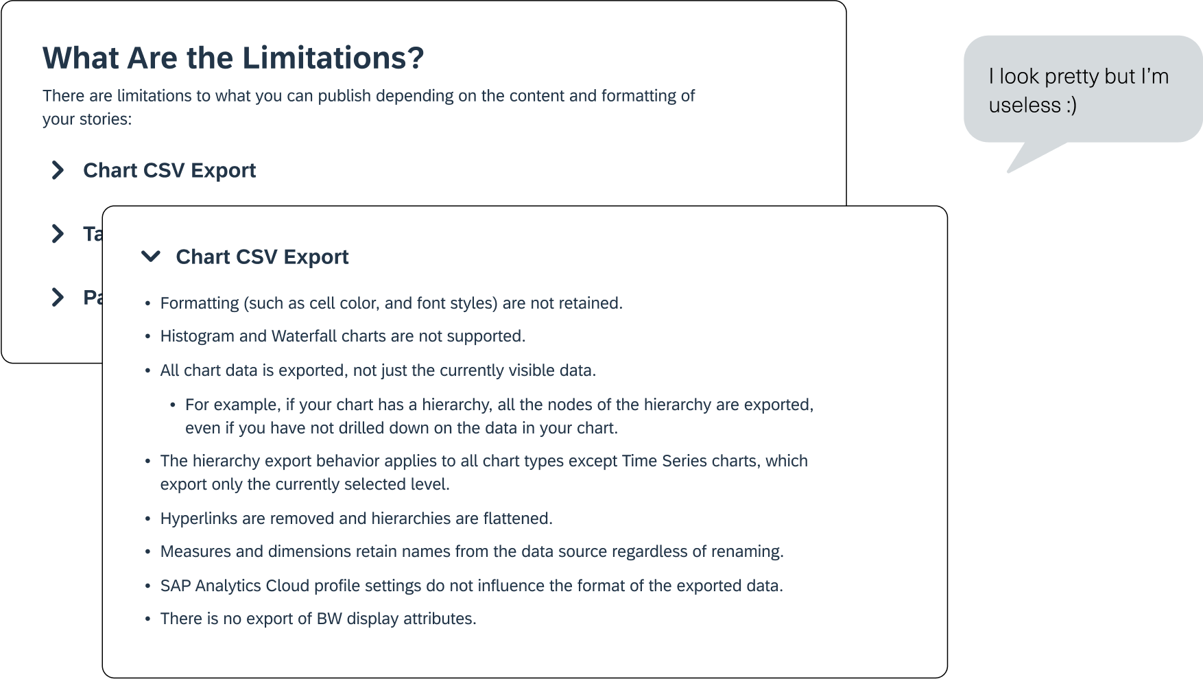
One of my complaints at the start of the process was that the existing documentation writing guidelines were written in an overwhelming wall of text, and it was important to me that if we were updating the guidelines, we presented them using the formatting we were suggesting, so the document itself was an example of what it was recommending.
I transformed the existing written guidelines into a more visual presentation format, using our own findings to ensure the information was easy to consume, using scannable visuals, bullets, and steps with visual examples of do’s and don'ts for each recommendation. I also created an infographic of an ideal help article for quick reference, that includes the order and purpose of each article section.
This project of formalizing the guidelines was also part of handover the intern that was taking over for me after I left, so I worked with her to transform the existing guidelines so she could get familiar with them, and give fresh insights on updated recommendations. This allowed me to practice a mentorship role, and delegate tasks based on learning outcomes.
Working with stakeholders on offshoot projects
At the same time, I was working with stakeholders outside of our team to improve the Help Portal experience from other angles, including improving the Help Portal interface, and supporting resource centralization across SAP using AI. I put together and presented targeted reports to stakeholders across SAP including the Help Portal development team, product support development lead, PMs, UA leads, and UA authors. When these projects picked up traction, I worked with stakeholders and created mockups and specs of recommended changes for development teams to implement.
Why is it significant to you?
This was an extensive project, running from October 2023 to August 2024 concurrently to my other work. I had asked to be involved in user research so was given this opportunity, but I ended up learning just as much if not more about project management, collaboration, and presenting ideas. It was significant, because it taught me to believe in my ideas, and take ownership over a project.
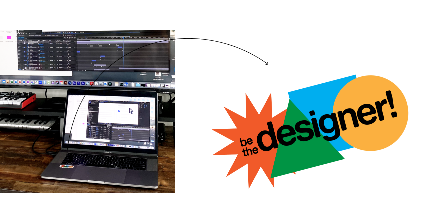
Work is very different from university, in that there aren’t clear criteria and success metrics, and that nobody is waiting for your work. You have to advocate for what you are doing to get resources and drive adoption. During this project I started using the mantra “be the designer” to remind myself that at the end of the day, I was the expert and could trust my judgment to make changes based on user feedback.
Learnings
Take your work (and yourself) seriously
Because I owned this project, I knew more about it than anyone on my team, so it came down to me to advocate for its value, and get others involved. I learned to present findings and recommendations with confidence so I would be taken seriously, and invite other stakeholders to get involved when I saw opportunities beyond my or my team’s immediate control.
Collect data with analysis in mind.
As mentioned, the session and survey did not line up for easy visualization, which created a lot of extra (and mind-bending) work to combine data sources. In the end, I was able to visualize the data together, but in the future would ensure this manual work would be avoided by making different datapoints line up from the start.
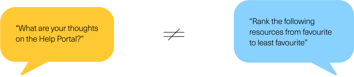
People do not mean what they say and do not know what they want.
People do not mean what they say and do not know what they want. It became clear in validation sessions especially, that people do not know what they want, so instead of listening to what they literally say, we stepped back to consider what they meant on a deeper level (cue my psychology minor).
The clearest example of this was when in initial validation sessions, every participant said they would prefer article sections to be enclosed in collapsible accordion tabs because it made articles much less overwhelming, and that they would have no trouble opening them if they needed the enclosed information. Then in the second round of validation testing, I asked participants where they would expect to find a certain piece of information enclosed in the tabs, and not a single participant could find it, or thought to open a tab and check. I realized what people were actually asking for was less context information up front, not to specifically hide the information in tabs, but they said they wanted this because it was the closest option to the actual solution.
When you don’t know what to do, get more data
There were several times in this project that I wasn’t sure what to do with findings, or the choice between options did not seem obvious, and in these cases it was invaluable to get more data by asking for feedback from my colleagues, and in some cases doing more rounds of user testing. Gathering input doesn’t impede creativity as I had previously wondered, but allows you to make confident and creative decisions that you can justify to others. I know we would not have had the support and adoption from others without the data to back it up.
Next Steps
Assessing feasibility
I met with UA leads to talk about the feasibility of the new recommendations, and they brought it to the documentation authors to assess, and add their input on what was technically feasible to implement.
Individual enablement
My team would then work with individual authors on enablement to implement the new article recommendations on targeted help sections based on popularity, and these sections would be used as a test, and example to other authors of what help documentation should look like.
Formalizing guidelines
Recommendations I wrote would be formalized into guidelines based on UA authors’ feedback, and rolled out for use by all Data and Analytics Design organization product help documentation.
More Projects
Design system and technical documentation for visual and multimedia enhancements to SAP Analytics Cloud documentation.

Personal ceramics business brand identity and visual presentation overhaul.